Tutorial: Creating a new list style from an existing one
A common development scenario starts when a web designer requests a new rendition for list styles on the front end. If the new list style is similar to one already existing in your theme, a good approach is to copy all the relevant files and modify them.
The following mock-ups are a specification for a new list style.

In addition, the specification requires changing media responsiveness when laying out a single column of promos under the lead.

Lastly, the specification requires updating the Less/CSS formatting for the smaller promos under the lead.

Upon review of the specification and the existing list styles, you determine that the new list style is closest to the existing list style Standard List I - 4 Column. In this tutorial, you replicate and then modify files from the list style Standard List I - 4 Column, creating a new list style Standard List M. Specifically, you will complete the following steps:
- Copy the existing list style's Handlebars, JSON, and Less files, and updated those copies to match the specification.
- Add the updated files to the theme build.
- Include the customized list style in the Styleguide UI.
- Build the theme and view it in the Styleguide UI; the theme will contain the customized list style.
Assumptions
This tutorial assumes the following:
- Familiarity with Handlebars, JSON, and Less files.
- Completion of the tutorial Using Styleguide to build your first theme.
Step 1: Copy and modify existing Handlebars file
In this step, you make a copy of the Handlebars file for the existing list style Standard List I - 4 Column, and modify it to render the customized list style.
- Retrieve the Styleguide training repository from https://github.com/perfectsense/training.git.
- In the repository's directory, change to
frontend/bundles/bundle-default/styleguide/page/list. - In that directory, do the following:
- Copy the file
PageListStandardI.hbstoPageListStandardM.hbs. - Open
PageListStandardM.hbsin a text editor. - Replace the second line:with the following:
<div class="PageListStandardI" data-module{{include "includes/PageList-attributes.hbs" this}}><div class="PageListStandardM" data-module{{include "includes/PageList-attributes.hbs" this}}> {{include "includes/PageList-header.hbs" this}}-
Introduces a new CSS selector
PageListStandardM. -
Adds the title for all items in the list (as specified in the mock-up).
-
- Replace the following lines:with the following:
{{#set imageSize="xl-16x9"}} {{#eq ../imagePositionVertical "top"}} {{include "/page/promo/PagePromoModuleA.hbs" this imagePositionVertical="top"}} {{else}} {{include "/page/promo/PagePromoModuleA.hbs" this imagePositionVertical="bottom"}} {{/eq}} {{/set}}{{#set imageSize="large-16x9"}} {{include "/page/promo/PagePromo.hbs" this}} {{/set}}-
Changes the size of the lead promo's image.
-
Applies the template for displaying the image followed by category, promo title, and promo description.
-
- Replace the following lines:with the following:
{{#eq ../listColumns234 "2"}} {{#eq this._template "/page/promo/PagePromo.hbs"}} {{#set imageSize="large-16x9"}} {{include "/page/promo/PagePromo.hbs" this mobileAltLayout="true" imagePositionVertical="top" description=null}} {{/set}} {{else}} {{render this}} {{/eq}} {{else}} {{#eq ../listColumns234 "4"}} {{#eq this._template "/page/promo/PagePromo.hbs"}} {{#set imageSize="medium-16x9"}} {{include "/page/promo/PagePromo.hbs" this mobileAltLayout="true" imagePositionVertical="top" description=null}} {{/set}} {{else}} {{render this}} {{/eq}} {{else}} {{#eq this._template "/page/promo/PagePromo.hbs"}} {{#set imageSize="medium-16x9"}} {{include "/page/promo/PagePromo.hbs" this mobileAltLayout="true" imagePositionVertical="top" description=null}} {{/set}} {{else}} {{render this}} {{/eq}} {{/eq}} {{/eq}}-
Lays out promos' text to the left of the promos' image. This specification required eliminating this effect.
{{#eq this._template "/page/promo/PagePromo.hbs"}} {{include "/page/promo/PagePromo.hbs" this}} {{else}} {{render this}} {{/eq}}-
Includes a Handlebars template for rendering a promo's category, title, description, and byline.
-
- After the above modifications, your Handlebars file is as follows:
{{#if items}} <div class="PageListStandardM" data-module{{include "includes/PageList-attributes.hbs" this}}> {{include "includes/PageList-header.hbs" this}} <div class="PageList-items"> <div class="PageList-items-item"> {{#with items.[0]}} {{#eq this._template "/page/promo/PagePromo.hbs"}} {{#set imageSize="large-16x9"}} {{include "/page/promo/PagePromo.hbs" this}} {{/set}} {{else}} {{render this}} {{/eq}} {{/with}} </div> {{#each items}} {{#if (gt @index 0)}} <div class="PageList-items-item"> {{#eq this._template "/page/promo/PagePromo.hbs"}} {{include "/page/promo/PagePromo.hbs" this}} {{else}} {{render this}} {{/eq}} </div> {{/if}} {{/each}} </div> {{include "includes/PageList-footer.hbs" this}} </div> {{/if}} - Save the file.
- Copy the file
Step 2: Copy and modify existing JSON file
In this step, you make a copy of the JSON file for the existing list style Standard List I - 4 Column, and modify it to render the customized list style.
- Continuing in the directory
frontend/bundles/bundle-default/styleguide/page/list, copy the filePageListStandardI-4column.jsontoPageListStandardM.json. - Open
PageListStandardM.jsonin a text editor. Replace the two lines:
"_styledTemplate": "/page/list/PageListStandardI.hbs",
"title": "Standard List I - 4 Column",
with the following:
"_styledTemplate": "/page/list/PageListStandardM.hbs", "title": "Standard List M",-
Refers to the Handlebars template you modified in Step 1.
-
Specifies the list style's label in Styleguide and in the module picker.
-
Replace the
itemsarray:"items": [ { "_include": "/page/promo/PagePromo.json", "title": "Standard List I - 4 Column", "type": "video" }, { "_include": "/page/promo/PagePromo.json" }, { "_include": "/page/promo/PagePromo.json" }, { "_include": "/page/promo/PagePromo.json" }, { "_include": "/page/promo/PagePromo.json" } ],with the following:
"items": [ { "_include": "/page/promo/PagePromo.json", "_repeat": 9 } ],-
Includes the JSON file for individual promos.
-
Specifies number of promos to include in the list: one lead and eight in the subsequent rows.
-
- Save the file.
Step 3: Copy and modify Less styling
In this step, you make a copy of the Less file for the existing list style Standard List I - 4 Column, and modify it to render the customized list style.
- Change to the directory
frontend/bundles/bundle-default/styleguide/styles/default/page/list/. - Copy the file
PageListStandardI.lesstoPageListStandardM.less. - Open
PageListStandardM.lessin a text editor. - In the first line, change
.PageListStandardIto.PageListStandardM. - Replace the stanza
&-item {(lines 7–57) with the following:&-item { border-bottom: 1px solid var(--color-list-border); padding-bottom: 20px; &:not(:first-child) { .PagePromo { &-title { &:extend(.promo-title-6 all); } } } } - Replace the media query
@mq-mdwith the following:@media @mq-md { .PageList-items { display: grid; gap: 20px; grid-template-columns: repeat(2, 1fr); grid-auto-flow: dense; &-item { grid-column: span 1; &:nth-of-type(1) { grid-column: span 2; grid-row: span 1; } } } } Replace the media query
@mq-lgwith the following:@media @mq-lg { .PageList-items { display: grid; gap: 20px; grid-template-columns: repeat(4, 1fr); grid-auto-flow: dense; &-item { grid-column: span 1; &:nth-of-type(1) { grid-column: span 4; grid-row: span 1; } } } }After the above modifications, your Less file is as follows:
.PageListStandardM { .PageList { &-items { display: grid; gap: 20px; &-item { border-bottom: 1px solid var(--color-list-border); padding-bottom: 20px; &:not(:first-child) { .PagePromo { &-title { &:extend(.promo-title-6 all); } } } } } } @media @mq-md { .PageList-items { display: grid; gap: 20px; grid-template-columns: repeat(2, 1fr); grid-auto-flow: dense; &-item { grid-column: span 1; &:nth-of-type(1) { grid-column: span 2; grid-row: span 1; } } } } @media @mq-lg { .PageList-items { display: grid; gap: 20px; grid-template-columns: repeat(4, 1fr); grid-auto-flow: dense; &-item { grid-column: span 1; &:nth-of-type(1) { grid-column: span 4; grid-row: span 1; } } } } }- Save the file.
Step 4: Include list style in build configuration
In this step, you include the customized list style in the theme's build configuration.
- Include the Less file from Step 3 in the build by doing the following:
- Change to the directory
frontend/bundles/bundle-default/styleguide/styles/default/page/list/. - Open the file
All.less. - Under the comment
Standard Page List styles, add the following line:@import 'PageListStandardM'; - Save the file.
- Change to the directory
- Include the JSON file into the build by doing the following:
- Change to the directory
frontend/bundle/default/styleguide/page/list/. - Open the configuration file
_PageList.config.json. Inside the
templatesarray (the one that is a sibling offields), paste the following object:{ "displayName": "Standard - List M", "example": "/page/list/PageListStandardM.json", "height": 800, "width": 1024, "fields": [ "backgroundColor", "inverseColors" ] }-
Specifies the style's name that appears in the module picker. Whenever you create a new style, the path to its data file must appear in the
examplekey. -
Refers to the JSON file you created in Step 2.
-
Specifies the height of the screenshot that the editor sees when picking this module in the module picker.
-
Specifies the width of the screenshot that the editor sees when picking this module in the module picker.
-
Adds front-end fields that allow editors to select a background color and inverse colors for this module in the Styles tab.
-
- Save the file.
- Change to the directory
Step 5: Include the list style in the Styleguide UI
In this step, you configure Styleguide to display the customized list style.
- Change to the directory
frontend/bundles/bundle-default/styleguide/. - Open the file
_navigation.config.json. In the array
pages(the one that is a sibling of"displayName": "Lists - Standard"), paste the following object:{ "displayName": "Standard List M", "page": "/page/list/PageListStandardM.json" }-
Specifies the list's name in Styleguide.
-
Refers to the JSON file you created in Step 2.
-
- Change to the directory
frontend/bundles/bundle-default/styleguide/page/list/. - Open the file
Page-withStandardLists.json. This file contains all the list styles. (Developers and testers can use this file to troubleshoot interactions within list styles, which is usually easier than clicking through the left-rail navigation in the Styleguide UI.) In the array
main, paste the following object:{ "_include": "/page/list/PageListStandardM.json" }-
Refers to the JSON file you created in Step 2.
-
Step 5: Build the theme
In this step, you build the theme and verify your customized list appears in the Styleguide UI.
- Change to the directory
frontend/bundles/bundle-default/. Build the theme and run Styleguide:
yarn server:styleguide- In a browser, open http://localhost:8080 and view the list at Lists - Standard > Standard List M.
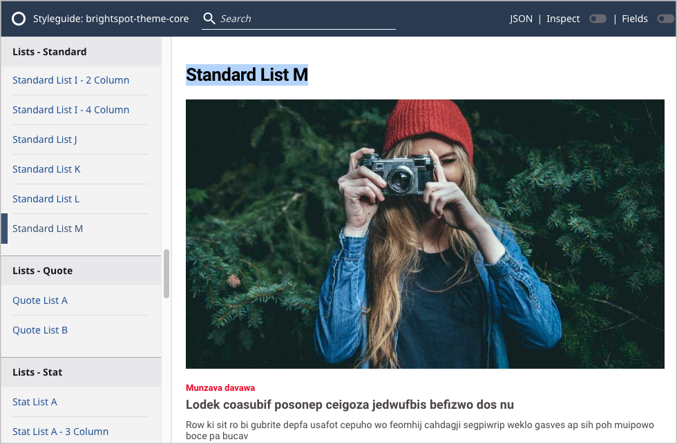
 Customized list style in Styleguide UI

In this step, you verified that yarn successfully built the theme, and your list style appears in the UI. After administrators install the built theme in Brightspot, editors see the customized list style in the module picker.
In this tutorial, you completed the following:
- Copied an existing list style's Handlebars, JSON, and Less files, and updated those copies to match the specification.
- Added the updated files to the theme build.
- Included the customized list style in the Styleguide UI.
- Built the theme and viewed it in the Styleguide UI; the theme contains the customized list style.